Leading organic producer and box supplier Riverford has unveiled a new logo and branding which it says underlines its passion and expertise in vegetables.
The new look, which will be found across the company and its franchisees on boxes, as well as delivery vans and the company’s website features colourful hand drawn vegetables and a black carrot silhouette. It is also using the tagline and social media hashtag ‘Live Life on the Veg.’. It worked with design agency Big Fish to achieve a look which would tell the Riverford story while engaging with customers.
Riverford’s Brand & Communications Manager, Vitha Powell explained, “We want to show the world we’re mad about – and experts in – veg. We want to put our authority about veg back at the heart of our business and think this new look and refocusing on veg will help us reach as many like-minded people as possible.”
She added, “The carrot is a distinctive, memorable shape that helps us communicate who we are and what we do. We have also changed our name very slightly from Riverford Organic Farms to Riverford Organic Farmers, to celebrate the fact that we are an independent, personal business and farmers at heart.”
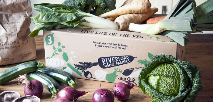
Photo Credit: Riverford Organic Farmers
The post Riverford rebrands appeared first on Hort News on 22 April 2016.